
Microsoft Internet Explorer for the Mac was discontinued in January 2006 when Microsoft announced they would no longer be providing any support or further development for their browser.
For some this came as no surprise, not only were Apple's Safari and Mozilla Firefox more widely used on the Mac platform, there were also up-and-coming browsers such as OmniWeb which were all better than what Microsoft had produced. People relying heavily on Internet Explorer for their online banking using web sites which were often optimized for Internet Explorer were rightfully worried. The browser also had its' quirks and rough edges that gave web developers everywhere headaches.
Despite all negativity towards Internet Explorer, it was still one of the better browsers when it was new, it also had some really useful features that has yet to be replicated by its more modern cousins. It is those features I want to tell you about.
Feature 1: "I Want The Content"
The toolbar, containing navigation buttons, the adress bar, bookmarks, etc. on the top of every browser window is large. Even when you do not use it, it still blocks prime screen real estate. Few users had screens larger than 1024x768 pixels by then, many had smaller screens. To remedy this, yet not making it noticeably harder to reach such widely used buttons as the back button, the developers at Microsoft created a Collapse feature which would hide everything which was not the web page itself and place the back, forward, reload and stop button on the side of the window, in practice giving you a full screen view of the web page. The only problem here might be that the back button is placed too close to the close button.
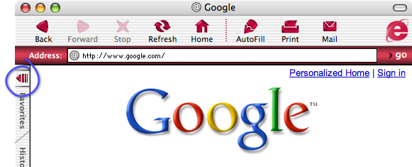
The normal Internet Explorer window, collapse button circled.
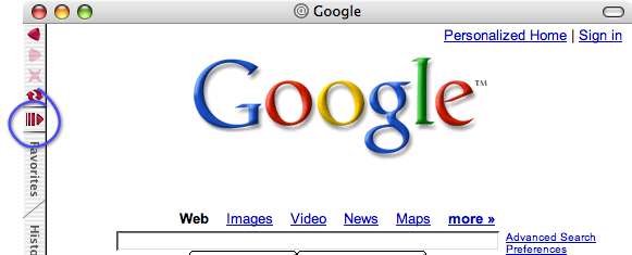
The collapsed Internet Explorer window, collapse button circled.
Feature 2: "Let's Save This For Later"
Similar to, yet better implemented from a user point of view, than the Web archives that some browsers are able to create today. What was so good about how Internet Explorer handled them was that they stayed in a tray in the browser window and had easily over-viewed information about the archives content. Still today all other browsers that I have used only save their archives to the users file system so that it has to be searched for every time. In Internet Explorer you clicked the Scrapbook panel and Boom! There they are.
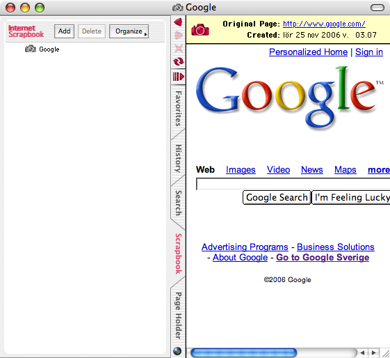
The Scrapbook saves web archives so you can go back later and look at exactly how the page looked like when you saved it.
Feature 3: "Keep The Links Readily Available"
The page holder is a very interesting feature. It held one page, any link you clicked in that page would be loaded in the right part of the browser window essentially giving you a tab to work with. Not only that, it could also remove all unnecessary graphics and display all links and only the links on the held page as text-only links. This was a great feature if you searched a lot and dug deeply into the search results. E.g. you made a search using your favorite search engine set to display 100 results, adding the results page to the Page Holder and clicking the button to make the Page Holder only display the links was great for skimming the titles for usable information. Or, if you found a page with lots of interesting information, you had a quick and convenient way of going back to where you started from.
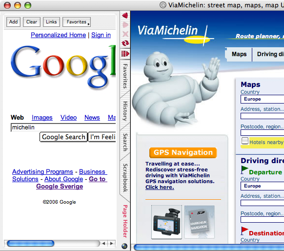
The Page Holder holds one page and every link you click there will show up in the standard (right) part of the browser window. This is what happened when I typed michelin in the search field and clicked the I'm feeling lucky button.