fyrkantigt.se

Sommarvärdar 2011 i Sveriges Radio P1 2011-06-22

Sommar i P1 har varje år flera uppskattade sommarvärdar. För enkelhetens skull har jag satt ihop en kalender du kan prenumerera på. På lördag inleder Mark Levengood årets säsong. Kalendern innehåller alla sändningstider och länkar till värdarnas presentationer på SR.

Kalendern fungerar givetvis i bland annat:
Google Calendar, använd Add → Import by URL eller Add → Import Calendar.
Apple iCal, använd Kalender → Prenumerera eller Arkiv → Importera….
Microsoft Outlook, använd Account Settings → Internet Calendars.

Ladda ner eller prenumerera på kalendern här.

Vad är en människa? # 2011-06-12

Fredrik Lindström pratar denna vecka med Peter Gärdenfors, professor och specialist på tänkande och medvetande. Varför vill vi hitta orsaker till allting? Är människan både djur och husse i samma kropp? Har vi alla en reptilhjärna innerst inne? (via Thomas Wreiner)

WikiPics 2 släppt 2011-05-30

Idag släppte jag en uppdaterad version av mitt tillägg för webbläsarna Google Chrome och Safari. Tillägget som möjliggör en mycket bättre upplevelse av bilder, fotografier och grafik på Wikipedia har jag förbättrat på ett flertal punkter, bland annat:

  • Ett helt nytt gränssnitt som lämnar ännu mer utrymme för bilden
  • Snabbare och bättre scrollning. Snabbare sidladdning och mindre minnesanvändning.
  • Statiska knappar som aldrig fylttar på sig gör att det är lätt att klicka vidare. Tangentbordsnavigering fungerar också bra.
  • Fancybox, som användes i den förra versionen används inte längre. Fancybox fungerade bra men min nya kod är mer optimerad för dessa specialfall.
  • All grafik (förutom ikonen) är numera skapade i CSS3.
  • jQuery har uppdaterats till version 1.6.1 och innehåller ett antal förbättringar.

Läs mer och hämta tillägget på sidan för WikiPics.

The CogTool Project # 2008-09-18

CogTool is a prototyping tool with a difference. Quickly mock-up designs in a storyboard, then demonstrate how to do tasks and CogTool runs an underlying cognitive engine to make predictions of task performance time for a skilled user. Use CogTool to benchmark competitors' products, or your own earlier versions, to be sure that your design will be more efficient for skilled users (one measure of value to your users). Use CogTool to explore a large design space and only invest in testing a few of the more promising ideas with users. Use CogTool to analyse a current product to find efficiency bottle necks and focus your redesign efforts. CogTool does not replace user testing, but it brings a complementary analytic technique to the UI design toolbox.

Downloaded. Looking forward to give it some tasks and see how it performs (pun partly intended). Only I am worried that this might put too much focus on only one quantitative (here time) aspect of user interaction. Other factors are error rates, success rates (objective and subjective), data collection and so on.

Simplicity Is Not the Answer # 2008-08-31

Donald Norman reposts an article for ACM on why simple interaction with things around us are not the best way to go about.

I conclude that the entire argument between features and simplicity is misguided. People might very well desire more capability and ease of use, but do not equate this to more features or to simplicity. What people want is usable devices, which translates into understandable ones.

The world is complex, and so too must be the activities that we perform. But that doesn’t mean that we must live in continual frustration. No. The whole point of human-centered design is to tame complexity, to turn what would appear to be a complicated tool into one that fits the task, that is understandable, usable, enjoyable.

Re-Regarding Disabled Menu Items 2008-08-26

John Gruber writes in response to Joel Spolsky:

This is why Spolsky is a Windows developer, not a Mac developer. Disabling menu items when they can’t be used is a fine practice — it means that the visual state of a menu item reflects the actual state of the command it represents. One can argue that this can be confusing for users who don’t understand why a particular menu item is currently disabled, but it’s a classic trade-off. Spolsky’s suggestion — that you leave all menu items enabled all the time and show an alert when they’re chosen but can’t be used — would be irritating as hell every time you ran into it.

I have to bite back and stand with Joel here. John, I thought you where on the side of the user when it comes to interface design.

I had this exact discussion years ago when I begun my university studies in cognitive sciences, while researching the subject further and conducting user tests it turned out that the user is indeed smart but also very lazy.

The results also gave some insight into how to solve the problem since less than 5% could tell why any chosen menu item was greyed out even if it was an application they were proficient in.

Also, there really are no excuses for not telling the user why the item is disabled. The logic behind the decision is already there in the code: The application has through a couple of rules decided that the item in question is not available, and it is very easy to reuse those rules to explain why.

By contrast the keyboard on your iPhone is not greyed out when it is not possible to use; it disappears. In the name of consistency and contextual usage interface items which are unavailable should therefore disappear.

Though the relation text field-keyboard is always only one step and therefore easy to figure out the relationship between a greyed out menu item and the logic behind that is often in the range 1-5 rules interacting. Therefore the rules ought to be explained to give this crucial information on why something happens.

In the end it comes down to the fact that people want to get down to business and do stuff, not figure stuff out, that is why the interface should assist the user, not the other way around.

Oh, did I say that this was already done in Mac OS 6?
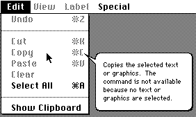
Mac OS 6 help bubbles

Times New Roman 2008-08-25

Like all good type nerds I have a dislike for Comic Sans, Arial, Verdana, Times New Roman and a handful other typefaces which dererve to be retired for better alternatives. However, lately I thought to myself: Why not try to do something nice with what Times New Roman has to offer? And suddenly I had myself a good set of boundaries and something to challenge – The essence of graphic design.

Objectify Me: Marian Bantjes and her toothbrush # 2008-08-21

Marian Bantjes found the perfect tooth brush while questing for knowledge on why so much energy is put into these tiny things and comes to realize that:

If everything in our lives were afforded the design attention that my toothbrush has, we would sit in chairs that floated while tickling our troubled backs, have tables that yielded at our aching elbows while remaining firm on top, walk on floors that tingled like active sand, and sleep on pillows that would never allow our ears to flatten against our heads.

True.

Pages

Nytt i min portfolio

Nytt i mitt galleri