fyrkantigt.se

Why Not Following The Apple HIG Might Be Good Idea 2008-03-10

More reasons why you should not follow Human Interface Guidelines by Matthew R, in a comment on the post The Beauty Of 99¢ iPhone Apps, by Jens Alfke:

Problem with this "live by our rule or die" approach is the fact that many apps for the Mac, we love so, because they disobeyed the HIG. And I don't necessarily mean extreme apps like Shapeshifter, but take for example the HIG saying don't create your own menu bar extras. That's reserved for the System. We completely shrugged that off and created our own menu bar extra-apps anyway. If there was (run with me on this) an App Store for the Mac; then apps like Quicksilver and Twitterrific would have been turned down.

Other excellent apps which breaks the HIG in this manner are:

And this is only one way in which the HIG in not followed in these applications. I am sure there is a slew of other ways as well. Developers break these guidelines, sometimes for a reason, sometimes by mistake, sometimes because the HIG simply did not describe a specific use case.

This is when the HIG are getting dangerous: They have become not only law in the sense that virtually everyone and their blogospehere mother were screaming for Apple to follow their guidelines. Now the same guidelines are the arbitrer of good applications for the iPhone. It is law.

Not to mention games. They are their own mini-environments with custom user interfaces.

iPhone SDK Problem: a stale UI 2008-03-07

Reading the documentation for the iPhone software development kit I found this in the iPhone SDK Agreement:

3.3.5 Applications must comply with the Human Interface Guidelines and other Documentation provided by Apple.

In other words: No new interaction concepts, no cool user interfaces, only the same that already is. Apple will decide based on flawed guidelines whether you spent weeks researching and testing your interface or not. Surprising move from a company so focused on being the leader of user interface design.

GrowlHUD 1.5 2008-02-11

Now with even more Leopard flavor added!

growlhud 1.5 screen

This release aims to make GrowlHUD even more at home in the Mac OS X Leopard 10.5 environment by using the real HUD Window (NSPanel) as the original. Therefore GrowlHUD no longer uses HMBlkAppKit by the Shira Project, which was good but not as like the Leopard HUD as I wanted.

Get GrowlHUD 1.5 Here →

Apple Resurrects Human Interface Guidelines 2008-01-24

The raised Human Interface Guidelines found here will never really be of long term use. There is a reason why they were once abandoned and left as it once was: They hinder new concepts from being implemented because you have to always adhere to strict rules.

Then, why not update the guidelines with the new concepts? Well, then it is no longer guidelines, then it is a constantly evolving document and nobody can use that. It simply becomes a mostly useless documentation in that case.

My bet is this document will wither and die (again) in the next few years. HIG and advancements are living contradictions.

The Information Machine (1958) # 2007-08-20

A short film by Charles Eames & Ray Eames for the IBM Pavilion at the 1958 Brussels World's Fair. The movie is a ten minute explanation on The Information Machine – the computer – through human development. It is worth noting the point of view on the computer as a tool, it has no value without human interaction, a concept that was lost and only now is on its way back.

You can also download a higher quality copy from Archive.org. Via Information Aesthetics.

Slate – Good navigation design 2007-07-30

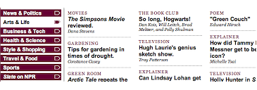
Slate Navigation Menu
Web magazine Slate utilizes a very interesting take on content navigation, where the usual navigation menu looks just like any other the difference is when you hover the menu. Instead of taking you deeper into the content tree structure it will show you the content of the articles found in that category. Simple, efficient and obvious. Why are we not seeing more sites that work like this?

Screw your customers # 2007-05-23

Trent Reznor, (singer and songwriter) in Nine Inch Nails:

...when I asked a label rep about this his response was: "It's because we know you have a real core audience that will pay whatever it costs when you put something out - you know, true fans. It's the pop stuff we have to discount to get people to buy." So... I guess as a reward for being a "true fan" you get ripped off.

Treat your customers with respect by putting out some good, usable content at a decent price and they will treat you with that precious green stuff you love.

The Web is no Longer Static 2007-04-19

The Future, Next Year

Xcerion have developed an interesting product: A platform for developing and serving applications via web browsers. They themselves call it an 'Internet Operating System', though that is not really the case, it is basically the most advanced JavaScript/AJAX application available today.

What's so great about this? Well for starters they have a very interesting developer suite with stuff like transactions to allow multiple users work on the same document at the same time and even que instructions sent to the server if the network goes down. That's not it, no matter how cool that part is.

What strikes me as the great impact this will have on the web is the fusion of the static content: Text, data, images, semantic markup – everything the web is about today, with the dynamic possibilities a new generation of networked applications to take advantage of the content online.

This might mean that companies no longer need to separate their collaboration, email and office systems but can combine them and streamline the experience for both the end users and the people responsible for the information architecture at the company. Or this might renew the role of the journalist that will no longer report so much short stories on single events but rater help aggregate new information as events unfold, use blogs, communicate more with people. As in the words of Dan Gillmor: The audience has a role to play in the future of journalism.

The web will clearly be about content and what to do with it.

Pages

Nytt i min portfolio

Nytt i mitt galleri