John Gruber writes in response to Joel Spolsky:
This is why Spolsky is a Windows developer, not a Mac developer. Disabling menu items when they can’t be used is a fine practice — it means that the visual state of a menu item reflects the actual state of the command it represents. One can argue that this can be confusing for users who don’t understand why a particular menu item is currently disabled, but it’s a classic trade-off. Spolsky’s suggestion — that you leave all menu items enabled all the time and show an alert when they’re chosen but can’t be used — would be irritating as hell every time you ran into it.
I have to bite back and stand with Joel here. John, I thought you where on the side of the user when it comes to interface design.
I had this exact discussion years ago when I begun my university studies in cognitive sciences, while researching the subject further and conducting user tests it turned out that the user is indeed smart but also very lazy.
The results also gave some insight into how to solve the problem since less than 5% could tell why any chosen menu item was greyed out even if it was an application they were proficient in.
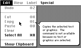
Also, there really are no excuses for not telling the user why the item is disabled. The logic behind the decision is already there in the code: The application has through a couple of rules decided that the item in question is not available, and it is very easy to reuse those rules to explain why.
By contrast the keyboard on your iPhone is not greyed out when it is not possible to use; it disappears. In the name of consistency and contextual usage interface items which are unavailable should therefore disappear.
Though the relation text field-keyboard is always only one step and therefore easy to figure out the relationship between a greyed out menu item and the logic behind that is often in the range 1-5 rules interacting. Therefore the rules ought to be explained to give this crucial information on why something happens.
In the end it comes down to the fact that people want to get down to business and do stuff, not figure stuff out, that is why the interface should assist the user, not the other way around.
Oh, did I say that this was already done in Mac OS 6?